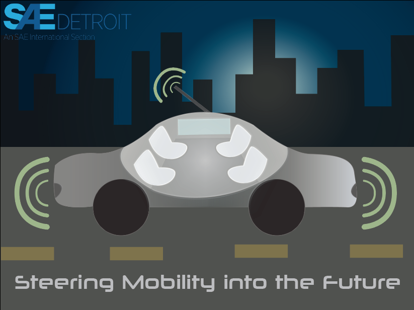
I used Adobe Illustrator to create my art piece. I wanted to show how much space the self-driving cars have and how these cars are our future. To show this I made the car see-through-like so that it gives the viewer an idea of what the car might look like. I picked out a light gray color gradient for the car so that it did not appear too flat or too overwhelming. I only used one effect, which was the plastic wrap on the car. This effect paired with the light gray from the car, helped brighten it so that the car contrasted the dark backgrounds. The signals around the car I did in green because the colors worked well together and people associate the color green with being good. I created a blue gradient to go with the city in the background. I had to be careful of which colors to use for the background because the darker it is the stronger contrast to the car, however too dark and it's illegible The font I used was neuropolitical, I chose it because it gave off a futuristic look.
